

Twitter. Wendy’s. Apple. Starbucks. Nike. Reading those brand names, it’s likely their iconic logos flashed into your mind. But why?
It’s simple: the human brain naturally assesses, memorizes, and assigns meaning to shapes. The way we process forms is a fundamental aspect of how humans learn (Wellesley College). The more distinct a logo is in its application of shapes, the more likely it is that we will store it in our memory. This means that just like colors or fonts, shapes are a critical element to consider when creating content, as they are capable of communicating distinct ideas and emotions to viewers. Choosing the right shape, whether it be a circle, a square, or a triangle, means your message gets conveyed clearly to your target. That’s why we’ve pulled together a list of standard shapes and what they represent.
Lines
When we say “shapes,” chances are your mind flashes to circles, rectangles, squares, etc. Though these may be the more obvious elements to think about, the impact of lines shouldn’t be overlooked. The formation of this simple component can have complex implications for your audience’s perception of your brand.
Vertical lines, for instance, generate subconscious connections with elegance, professionalism, cultivation, and strength. Compelling and engaging, vertical lines naturally draw the attention of the viewer downwards, thereby lending designs a sense of motion and animation.
Horizontal lines create a sense of reliability, tranquility, and calm. Because they emanate a sense of peace, horizontal lines subtly work to make your audience feel comforted and protected.
Cisco and IBM are two technology companies that utilize lines in their logos to achieve vastly different effects. Cisco’s vertical lines represent the constant innovation and thought-leadership the company is notorious for, while IBM’s horizontal lines convey the steadfastness and infallibility a company considered the forefather of the tech space would represent.
![]()
![]()
Triangles
Triangles wear a lot of hats when it comes to inspiring emotions and ideas: from emanating potent potential to establishing hierarchy, to embodying unabating improvement and innovation, triangles can do it all (and say it all) for your brand. Though they can be challenging to incorporate into design, as their experimental attitude can work against the security companies want to communicate to audiences, brands and products like Google Drive have been able to utilize triangles to boost brand awareness in a crowded market and relate their unique features.
![]()
Squares
The opposite of triangles, squares, with their equal, substantial proportions, can be enough to galvanize trust in consumers who seek safety and strength in their products. After all, the items most associated with security tend to be rectangular or square (e.g., houses, safes, vaults). Squares also represent professionalism, balance, power, and proportion.
As a networking site synonymous with professionalism, LinkedIn employs square elements heavily in its design. Not only does the shape represent mastery of professional skills, but also the powerful effect networking can have on one’s career.
![]()
Circles
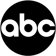
Circles are a straightforward and efficient way to portray unity, community, comfort, and steadiness. They tend to represent more positive, emotional messages, as their soft curves and wholesome (no pun intended) appearance makes them more welcoming than sharp, harsh-angled shapes like squares, rectangles, and triangles. Community and inclusivity are hallmarks of ABC’s channels. With their shows and platform spanning a multitude of topics, covering everything from news to comedy, the circle is a perfect way to encapsulate the unity of variety under one umbrella.
Spirals
Looking to stand out from the crowd? Spirals may be an excellent choice for your brand! The hypnotic and centralizing qualities of spirals often joked about in Saturday morning cartoons aren’t far from the truth. This shape draws people in and piques their curiosity, making it excellent for thoroughly engaging consumers. Often found in the environment (look at the Fibonacci sequence!), the spiral can express the ideas of growth, nature, fertility, and transformation.
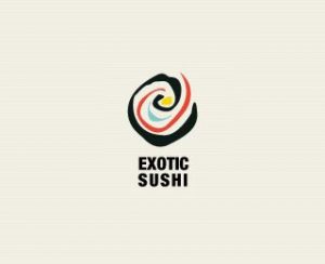
Exotic Sushi plays off the natural spiral found in the design of traditional sushi, but it also expresses the all-natural, fresh ingredients used in their sushi. The design of the logo will draw people in, but the quality product will make them stay!
Organic Shapes
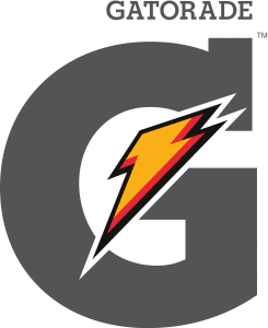
The term “organic shapes” is used to describe those shapes that occur naturally in the environment; they are not human-made or manufactured. In design, these shapes create a sense of warmth and reassurance not seen in a geometrically perfect triangle or rectangle. When using organic shapes, it’s essential to choose one that resonates with your company’s message and values. Gatorade’s universally recognizable lightning bolt symbolizes how their product energizes and invigorates drinkers, helping them achieve ultimate power in their performance.
Is your brand’s design not shaping up the way you’d like? Let MOSAIC help! Our design and marketing experts can work with you to help ensure your brand falls in line (or square) with your marketing message.