

Landing pages on your website can serve many purposes. For example, your most basic landing page – the home page – should help people quickly get to other content and areas of the site that interest them. Other landing pages can be more informational in nature and provide visitors with the details they need about a product or service. Finally, some aim to get users interested in an offer or a particular call to action – actions leading to an acquisition or conversion. For the purposes of this blog, we’ll focus our attention on the latter, especially those that are developed (at least partially) in concert with advertising that brings individuals to a particular page.
Designing Your Landing Pages to Make Them Great
Like any other aspect of your website, the design of a landing page’s user experience is most certainly a mix of art and science. And whether you do it yourself or hire an agency like MOSAIC, we would recommend keeping certain visual and interactive elements in mind as you go. Here are five elements to consider as you develop the experience.
No. 1: Know the Ultimate Goal (Make Sure There’s Only One)
We’ve seen many landing pages that give visitors too many options or a number of different next steps. The result is an experience where the visitor can’t decide what to do and either navigates elsewhere or leaves the site completely. That’s why we at MOSAIC recommend determining that single goal upfront and reinforcing that throughout the page. It doesn’t matter if that’s downloading a guide, filling in a form, contacting a salesperson, or another form of conversion. You should make sure the goal you set is the primary next step on the page and that any messaging contributes toward that single goal as one moves down the page.
Many UX designers, in fact, often leave off other common elements of a landing page such as navigation or the footer so the visitor can hone in on that singular focus. This is especially true for landing pages that are designed for email or ad campaigns. To be clear, we’re not advocating going that far, as it’s OK in our book if you attract visitors who use your navigation or the footer to explore other aspects of your website. (Plus, many landing pages can have dual uses for SEO and paid/email campaigns so you’ll want to keep as many options open for your users as possible to discover your pages.) The main point here is that the body of the page should have that central focus front and center.
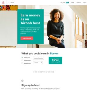
Elements in Action: Airbnb
Even a brief glance at this Airbnb landing page allows you to absorb its goal: It wants you to sign up to be an Airbnb host. This intent is not only cleverly reinforced throughout the entirety of the page, but it is also restated and reiterated to appeal to a variety of audiences. From the clear and compelling CTA at the top of the page for those who need no convincing to the calculator designed to compel individuals motivated by ROI, to the step-by-step instructions for the visitor who needs to know how something works before they invest, the landing page drives all audiences towards taking the desired action.
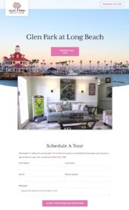
Elements in Action: Glen Park
Glen Park’s “Schedule a Visit” landing page takes our advice of forgoing navigation or a footer and instead focuses on homing in on the visitor’s primary next step. This makes it more likely that the target audience will schedule a tour and learn more about the community. Leaving off these design elements was also a particularly smart move given that the audience for an assisted living facility like Glen Park is typically less tech-savvy. If footers or navigation were present on the page, there is a chance a visitor could get distracted from the goal and navigate away from the page at best or confused and give up on scheduling a visit entirely at worst. By keeping the page to a singular focus, Glen Park creates a seamless user experience.
No. 2: Use ‘High-Quality’ Visuals – and ‘Airy’ Design
Obviously, using high-quality visuals such as photos or video is foundational to any good page. “High-quality” doesn’t stop with just how it looks, however. For example, sometimes we’ll see pages that are visually stunning but the image or video itself doesn’t communicate the same thing as the copy. That may be due to the fact that designers can fall in love with a particular visual design or concept regardless of the core goal defined or even the company brand and audience. Trust us, it’s an easy trap to fall into. One good rule of thumb here is that any visual you use should: a.) Be on brand (color-wise and topic-wise); and b.) Should communicate what the page is about on its own.
The other aspect of landing-page design involves the concept of “air.” Too much information crowded into one viewing window can cause a chaotic and overwhelming visual experience. Great landing pages always keep this in mind with no more than 4 to 5 options in any given viewing area on a desktop and 1 to 2 options maximum on mobile.
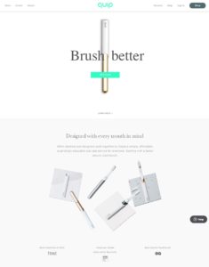
Elements in Action: Quip
Quip is a brand that is all about enhancing user experience – and that philosophy extends to their landing page! The fantastic use of negative (or ‘airy’) space coupled with the high-quality visuals creates an inviting page primed for enticing audiences to interact with Quip’s goal. Additionally, the images and the copy communicate a unified, cohesive message. The page’s content describes a toothbrush “designed” at every level, including the brushing experience, the affordable price, and the actual form of the toothbrush, while the page’s visuals reinforce that with stunning shots of a minimalistic yet eye-catching product.
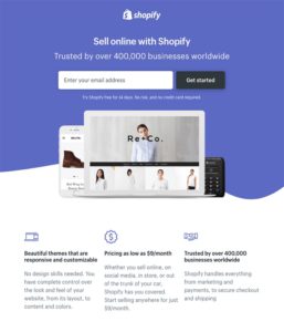
Elements in Action: Shopify
While Shopify’s page has a bit more going on than Quip’s landing page, it demonstrates that you don’t have to trade aesthetic design for informative content. The use of icons here in particular is an excellent example of how visuals can communicate what a page is about. The icon of shaking hands is a universal symbol of trust, the single dollar sign is often used to indicate a low price, and the laptop and mobile phone icon is common shorthand in design for design layouts or themes. Without reading the accompanying copy, we have a good idea of the favorable points that are about to be made.
No. 3: Don’t Overload the Page with Text
Landing pages aren’t meant to be blogs. That is, with a blog, visitors know and expect to read longer paragraphs and get more robust, in-depth information. On a landing page, visitors scan. The old adage that website visitors scan landing pages in a Z-shape on a desktop (starting with the top left, moving to the right and dipping horizontally to the lower left and lower right) is still true today. On mobile, it’s more of a ‘F’-shape that users will employ as they scan down the page. Either way, what your visitors are doing on any page is looking for information relevant to them. When there’s too much text, they can get overwhelmed and each element on the page won’t stand out as much.
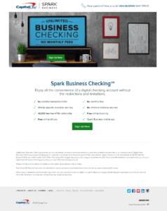
Elements in Action: Capital One
Capital One’s Spark Business landing page is a quintessential example of the ‘Z-shape’ we discussed above. At the top, the visitor gets a good sense of what the page is dedicated to, and as they move down and to the left, they learn more information about the checking account until they hit the more optional information at the bottom of the page. This shape also does a great job of reinforcing the hierarchy of information the page wants to convey without being too wordy.
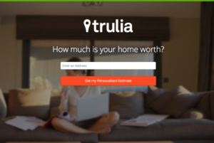
Elements in Action: Trulia
Unlike the Capital One landing page, which was designed with desktops in mind, this Trulia landing page can work both on desktop and mobile. The minimal text is short, sweet, and scannable, meaning the user can find what they’re looking for faster.
No 4. Add ‘Social Proof’
The ultimate goal of any landing page – say a download, a form-fill, the contact of a sales representative, or whatever “conversion” you define – is often different than what it takes to get the visitor to do that intended action. That’s when having some sort of “social proof” on the page is helpful. Social proof is really just a fancy way of saying you have evidence that individuals trust you as a company, or your products and services. Social proof can take the form of different types of content – testimonials, video case studies, quotes from customers in social media, examples of current company clients, and/or images of individuals demonstrating the use of your product or service.
A few tips as you consider social proof for your landing page:
- Generally, it’s important to include a diverse cross-section of individuals. Even if your product/service is for only men or women, make sure it includes different-looking individuals within those groups – of races, ages or whoever the intended audience is.
- Testimonials are great, but testimonials with images are even better. The reason is that your website visitors identify with “faces” and inevitably you can communicate the human element of your product or service more effectively.
- Choose examples that demonstrate your “authority” or “mastery” of a particular topic or area.
- For the purposes of the landing page, avoid taking people to a separate page if at all possible. Again, the focus of any next click should be on your core, intended goal.
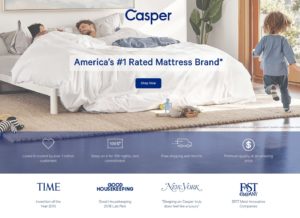
Elements in Action: Casper
For their product’s social proof, Casper elects to include testimonials from trusted, established sources. Names like Time and Good Housekeeping carry quite a bit of weight with many audiences, so their inclusion speaks to Casper’s authority in the mattress industry. It’s also important to note that the landing page includes a mix of awards and quotes awarded to Casper from these trusted sources. Diversifying the types of social proof you offer can make your brand, product, or service appear even more trustworthy.
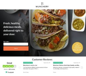
Elements in Action: Munchery
Munchery’s page includes some of the most compelling social proof you can provide: direct quotes from real users. In fact, word-of-mouth marketing like this has been shown to generate 5 times more sales than paid media (Source), so the inclusion of customer reviews here makes the page all the more powerful. Also, the testimonials on the page appear to be from both men and women, which allows Munchery to appear inclusive and appeal to a wider audience.
No. 5: Build In an Enticing Call to Action
For most landing pages, you’ll want to have a main call-to-action button (or several on the page that essentially do the same thing). The language you use certainly matters here, especially if you can create the incentive to click. Need some examples? Here are a few different options:
- Sign Up
- Join Free
- Download for Free
- Give [___] a Try!
- Get Your Free Copy!
- Send Me the Guide!
- Claim Your Free Trial
- Learn More
- Click Here to Get Started
- Get Started Today
- Dive In
- Yes, Give Me My Free Copy!
- Take Me There
- Subscribe Now
- Get It Now! Limited Time Only.
- Grab the Template
Obviously, there are a lot more variations and much depends on the action you want your visitors to take, but this should give you an idea. One tip: If something is only available for a limited time, make sure to mention either in the call to action to create a sense of urgency. Similarly, if something is free, it will help to reiterate that on the call-to-action button.
Lastly, when it comes to any button, we can’t emphasize enough that the color of it should stand out on the page. Time and time again, we see call-to-action buttons that don’t visually “pop,” leaving the visitor to often miss it or not sure what to do next. One tip: Make sure the button works with the color palette of the page and the brand. From a digital marketing perspective, it’s also helpful to see if the audience responds to an A/B test – such as a button color that works better on a particular page.
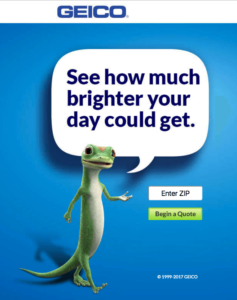
Elements in Action: Geico
While the actual CTA of Geico’s landing page is strong, we want to draw attention to how the color of the CTA button works on multiple levels. First, the shade of green chosen “pops” against the blue background and draws attention to the page’s goal immediately. Second, that green color is present in the overall color palette of the brand, so its usage here promotes a consistent brand experience for the consumer across all potential touchpoints. Finally, the vibrant hue tied to getting a quote from Geico subtly reinforces the idea the page’s copy is attempting to get across: your day could get “brighter” by clicking on the bright button!
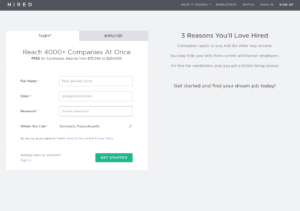
Elements in Action: Hired
The CTA of the page’s form offers the user a strong incentive to click on it and continue building their profile. Hired’s word choice here is important to note. Finding a new job or career is similar to beginning a long journey. By using the term “get started,” Hired invites the visitor to take the first steps on the path to their dream job.
Conclusion
We hope the tips provided above have been helpful as consider building out better landing pages that convert. At MOSAIC, we specialize in user-experience design and helping you generate business and leads from your pages (utilizing many of the above techniques). Contact us for design services or if you need some additional support in another area such as print, digital marketing, or branded merchandise or any promotional activity. We’re here to help you.